
7 Outdated Web Design Trends That You Need to Abandon
Is Your Website Aging Badly? There are a few things that can put the brakes on a solid prospect’s relationship with your brand, and a bad website is among the quickest.
The majority of customers who visit your website will spend less than 15 seconds on the home page before clicking off; this means you have 15 seconds to capture their attention and present them with information that will help them invest interest in your brand.
Unfortunately, many brands are employing outdated, unattractive website design elements and features, increasing the number of prospects who leave their websites before they know the first thing about the company.
Is your website’s bounce rate high? Are you displeased with the amount of traffic you generate each month? It might be the outdated trends you’re employing in your web design.
Here are 7 website trends that you need to abandon today.
1. Non-Mobile-Friendly
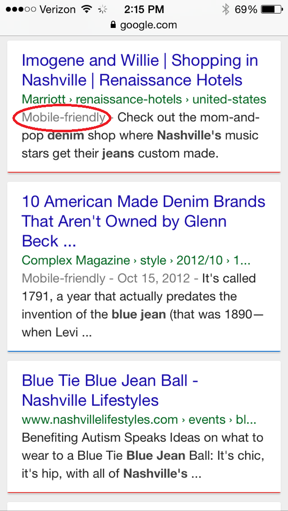
Recent studies have shown that more than half of local searches are done on a mobile device. That means that you are losing out on a huge chunk of potential customers by leaving your website without mobile capabilities.
What’s more, Google’s recent announcement of search-result penalties for non-mobile- friendly websites spells an even worse fate for companies who have yet to make their website accessible for mobile users.
If you haven’t embraced the mobile way, your website is likely being missed by a huge swath of potential customers.
2. Too Much Design

Over-designed websites that are cluttered and crammed full of text will send your visitors away in droves; if they can’t cut through the noise of your website’s design and get a succinct idea of what your brand is all about, they’re out of there.
Simple, streamlined design is more efficient in communicating who your company is, what your brand represents and what you can do for your customers.
The average online prospect is impatient; they aren’t willing to invest time in sifting through the clutter and finding the information they’re looking for. They will simply click off your page and go to your competitor’s.
3. Flash Intro

Flash intros are some of the most frustrating website elements from a user’s point of view; they aren’t compatible with most mobile devices, they cause the page to load more slowly and they present a huge and frustrating distraction for users who just want to get to the information.
Don’t opt for flashy (pun intended) website elements that offer no real value or substance for your users. If you’ve been drawn in by the idea of a crazy flash intro for your homepage, fight the urge with everything you have.
4. Long winded text
 Visitors want you to get to the point clearly and quickly. Bullet points are a great alternative to long paragraphs, especially as they make it easy to skim your content on a mobile device.
5. Autoplay media elements
The first thing that autoplay media elements such as music and video do is make the site visitors confused. When a visitor lands on a site and autoplay music starts on its own or a video begins to play automatically, he initially doesn’t understand what is the actual source of the media that is being played.
If the speaker is on, then the visitor suddenly starts to hear a voice. At first, he doesn’t understand from where the sound is coming, then after sometimes, he locates the source and either puts the video/music on pause. It’s a sheer annoyance and site visitors feel pissed when they come across troubles such as this. Most of them close the tab on the browser and never open it again.
Autoplay media elements are not only annoying but also consume a lot of visitor’s bandwidths unnecessarily. Since autoplay music/video amounts to user’s dissatisfaction, a site should steer clear of them. Multimedia content is immensely useful for online marketing and for that reason, video/music should be embedded in a site. The only thing that the site owner needs to bear in mind is the music or the video shouldn’t be autoplay.
7. Outdated Fonts and Style Elements

Your website’s design can communicate a wealth of things about your brand. When your website screams “It’s the Year 2002,” you can expect your visitors to search for more relevant avenues towards a service or product.Outdated fonts are a good indicator that your design team is behind the times; think Comic Sans, Times New Roman and Arial.
Design techniques from the early aughts, like using bevel and emboss on titles or in content on your homepage, is an indicator that your company has some catching up to do when it comes to your website and the content therein.
7. Unwanted popups
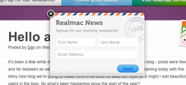 Whether you are inviting visitors to like you on Facebook, join your newsletter, enter a competition, or chat with a live representative, nobody wants to see your popup. They can be very annoying for visitors, and can detract from the great website they do want to see.


